All extensions
ResponsiveKit
See any page on phone, tablet and desktop
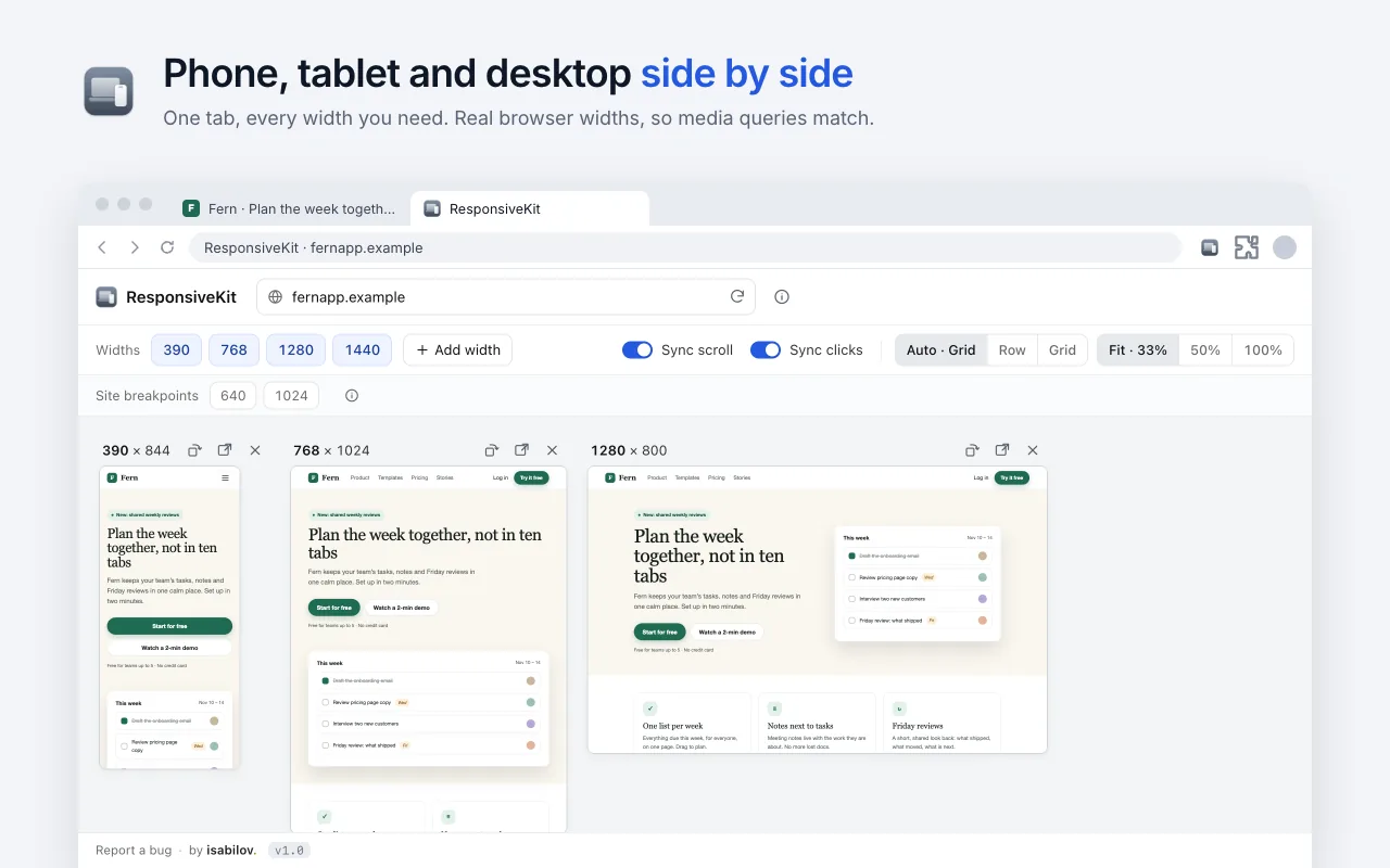
ResponsiveKit shows any web page at several widths side by side, in one tab, so you can check a responsive layout without resizing your window again and again.
No account, no tracking, no servers. It asks for access one site at a time, only when you preview it. Read the policy
- 01
Every width at once
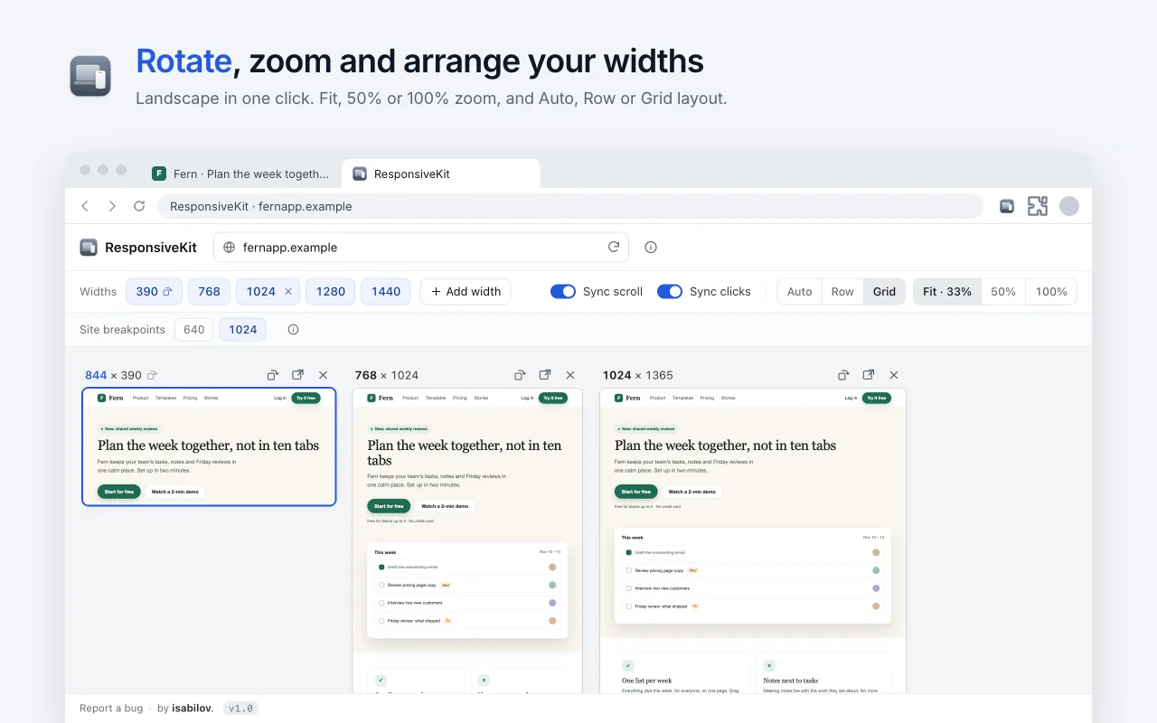
See the page at 390, 768, 1280 and 1440 px, or add your own widths and rotate to landscape.
- 02
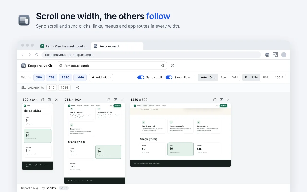
Synced scroll and clicks
Scroll or click in one width and the others follow.
- 03
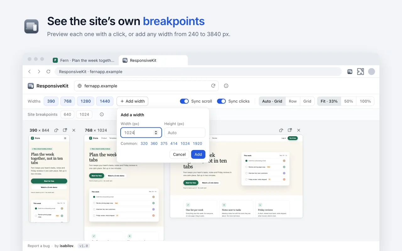
Site breakpoints
Find the widths where the page's own CSS changes layout and preview each in one click.
- 04
Drag to resize
Drag a width's edge to resize it; it snaps to the site's breakpoints.
Version 1.0.0Developer ToolsFree