
Mpay.
One payments ecosystem, 12+ products: from the MPAY app to terminals, mobile POS and an AML module, all on one design system.
MPAY: an e-wallet and payments ecosystem in Azerbaijan. Consumer and business apps, dashboards, back office, terminals and mobile POS, designed as one system.
- 500K+
- Downloads of the MPAY app on Google Play
- 18K+
- User ratings across Google Play and the App Store, 4.8★ on iOS
- 12+
- Products designed since 2021, from mobile apps to terminals
Challenge
Grow one e-wallet into a full payments ecosystem — consumer app, business app, dashboards, back office, terminals and POS — without every product feeling like a different company.
What I did
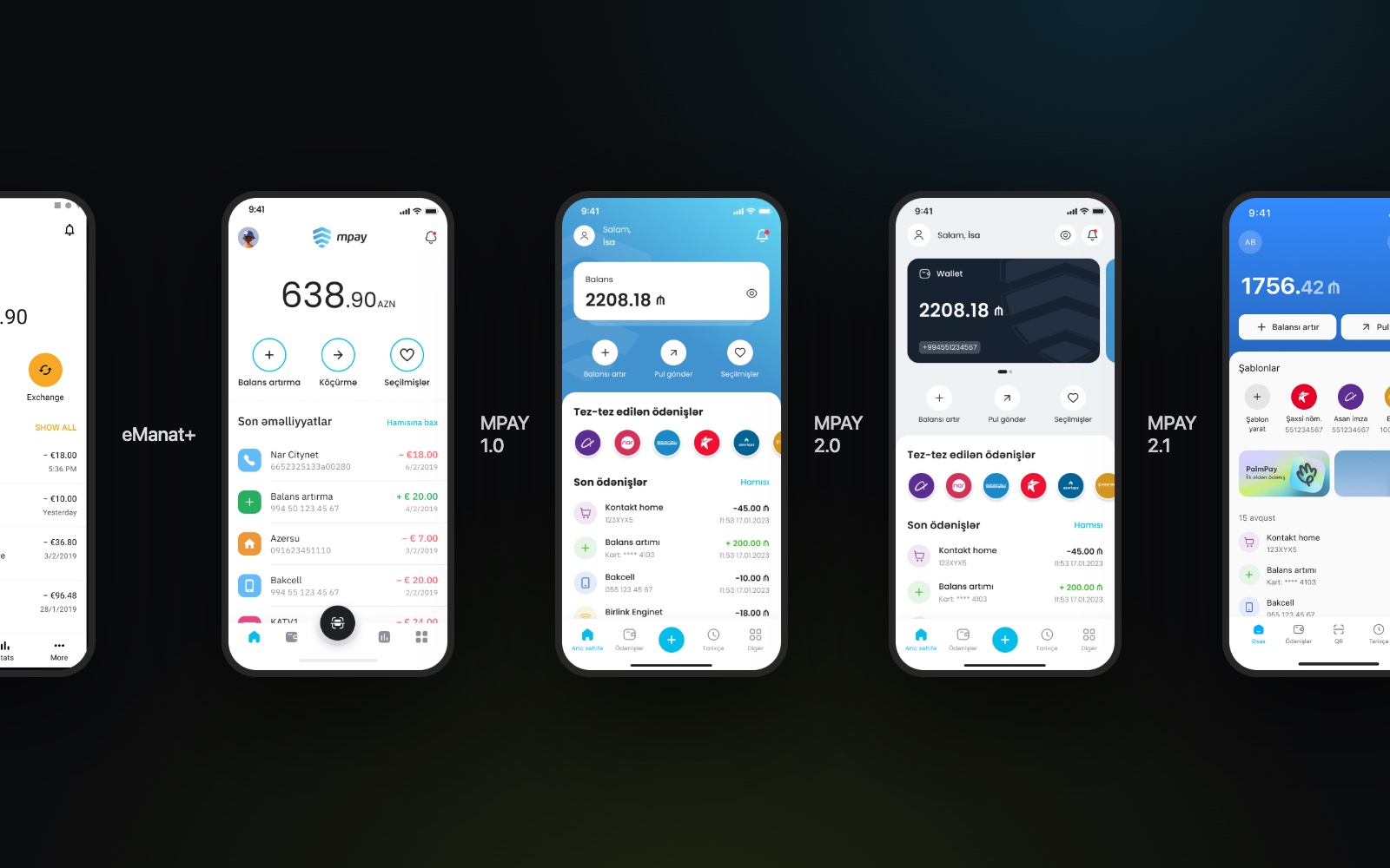
Designed 12+ products over five years: MPAY 1.0, 2.0 and 2.1, MPAY Business, dashboards, back office, terminals, mobile POS and the AML module, plus the UI kit and design system they share.
Impact
One consistent MPAY experience across app, web and terminal, used by hundreds of thousands of people, and a design system the team builds new products on.
01
Context
MPAY is an e-wallet and payment service in Azerbaijan. People pay utilities, mobile, internet, TV and hundreds of other services, transfer money to cards and wallets, and top up their balance with a bank card or at MPAY and eManat terminals. Payments can be made in the mobile app, on the website or at a terminal, and the app reads Azəriqaz, Azərsu, Gallus Pay and Makel NFC utility cards directly from the phone. I joined in 2021 with the eManat+ app and the first UI kit, and since then I've designed the products around it: the MPAY app from 1.0 to 2.1, MPAY Business, the merchant dashboard, back office, terminals, mobile POS and, most recently, the AML module.
02
The problem
Every new channel brought its own users and constraints: consumers on phones, merchants on dashboards and POS, operators in the back office, and people paying cash at a terminal. Without a shared foundation, each product would drift into its own patterns and the same payment would look and behave differently depending on where you made it. At the same time the domain is regulated and full of edge cases: KYC, limits, failed payments, refunds and anti-money-laundering checks.
Constraints
- Five platforms: mobile, web, dashboard, terminal, POS
- Regulated fintech: KYC and AML
- Hundreds of service providers
- Legacy flows from earlier versions
- Hardware screens on terminals and POS
03
Goals
Business goals
- Turn a single e-wallet into an ecosystem of consumer and business products
- Ship new products faster on a shared UI kit and design system
- Meet regulatory requirements without adding friction to everyday payments
User goals
- Pay any bill or send money in a few taps
- See balance, frequent payments and history at a glance
- Get the same experience in the app, on the web and at a terminal
04
Discovery
- Insight 01
Most payments repeat
Utilities, mobile and internet are paid every month. Favourites, debt notifications and automatic payments turned repeat bills into one tap.
- Insight 02
Recognition beats reading
With hundreds of providers, people look for a logo before a name. That's why the logo library grew to more than 800 provider logos.
- Insight 03
One system, many screens
The same payment runs on a phone, a dashboard and a terminal. Designing it once in a shared system kept every channel consistent.
05
The solution
Everything on the home screen
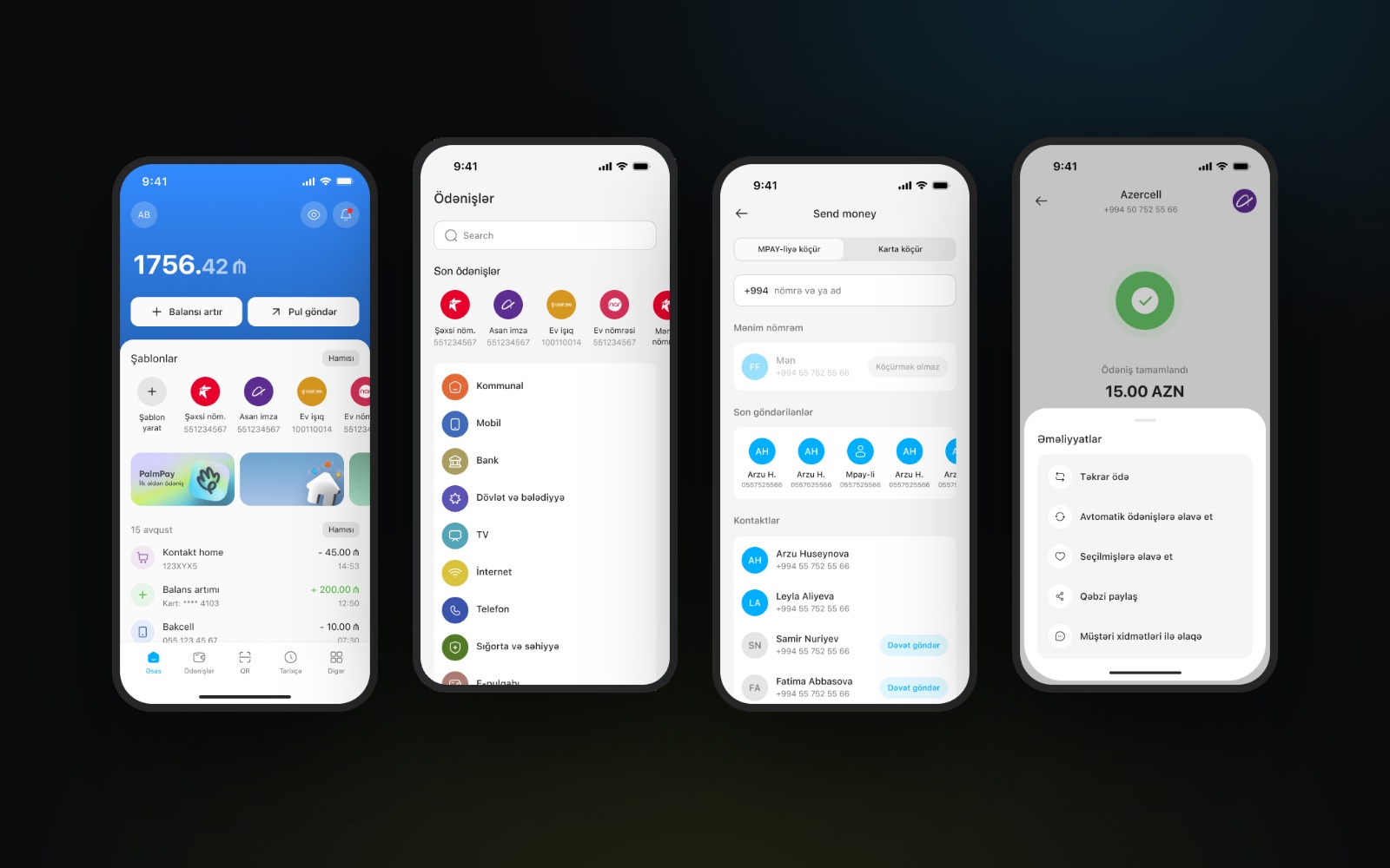
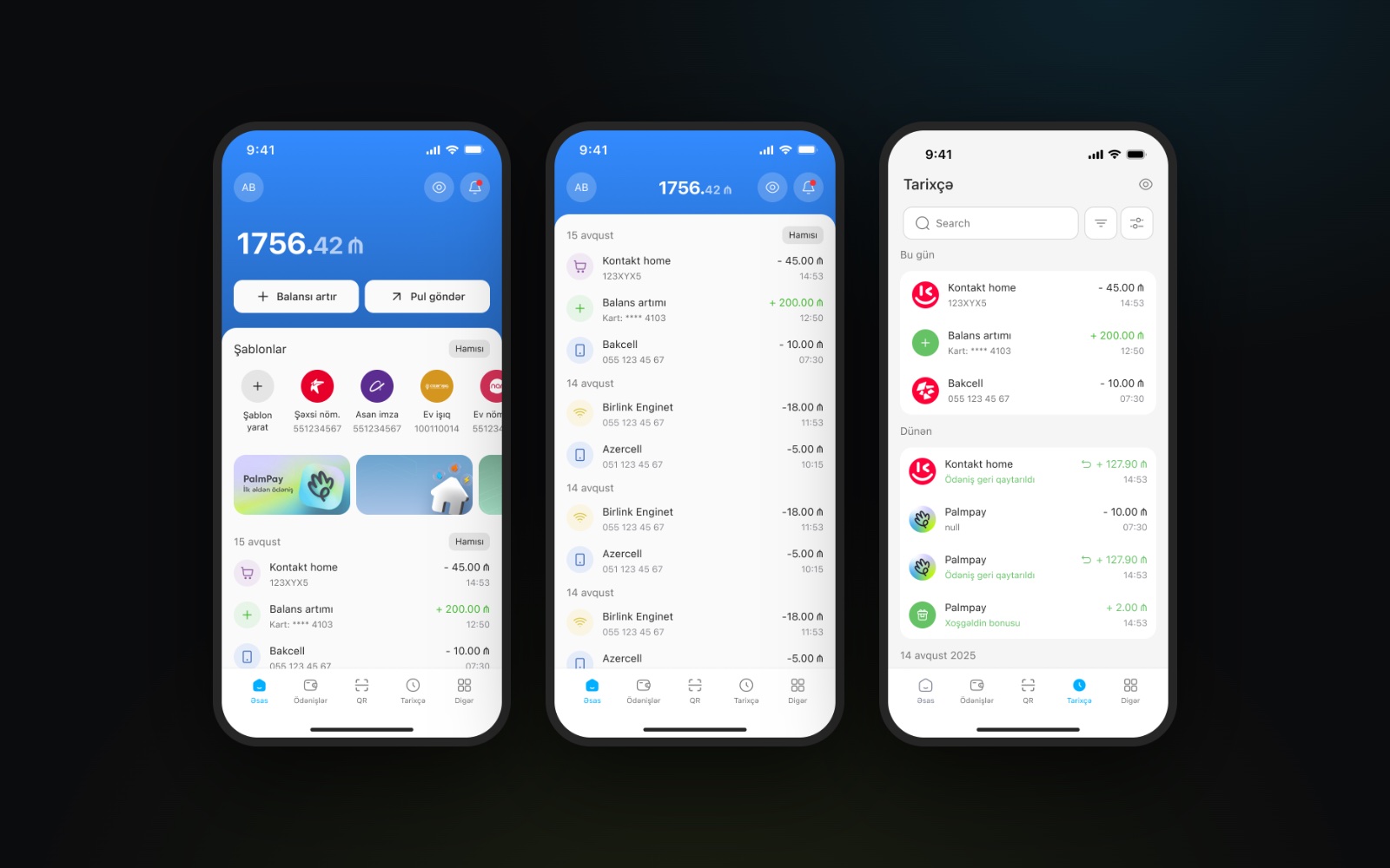
Balance, top-up and send money up front, then payment templates, product banners like PalmPay and the latest activity grouped by day — with the full history one tap away.
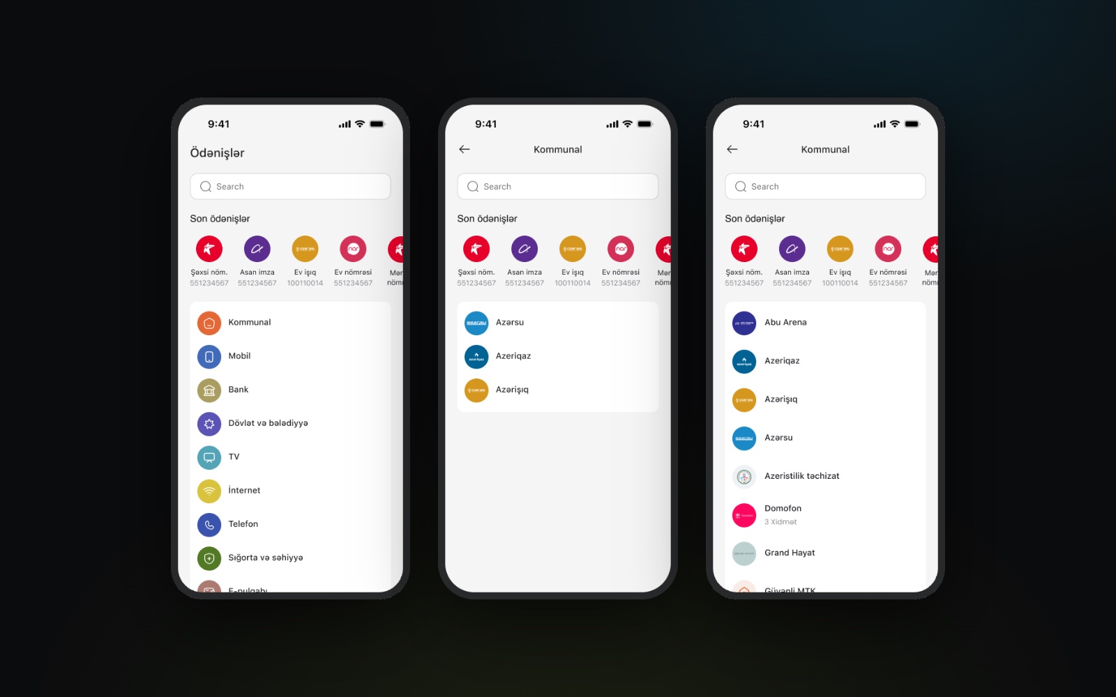
Hundreds of services, one catalogue
Recent payments on top, then clear categories — utilities, mobile, bank, government, TV, internet and more — each opening its providers, with search throughout.
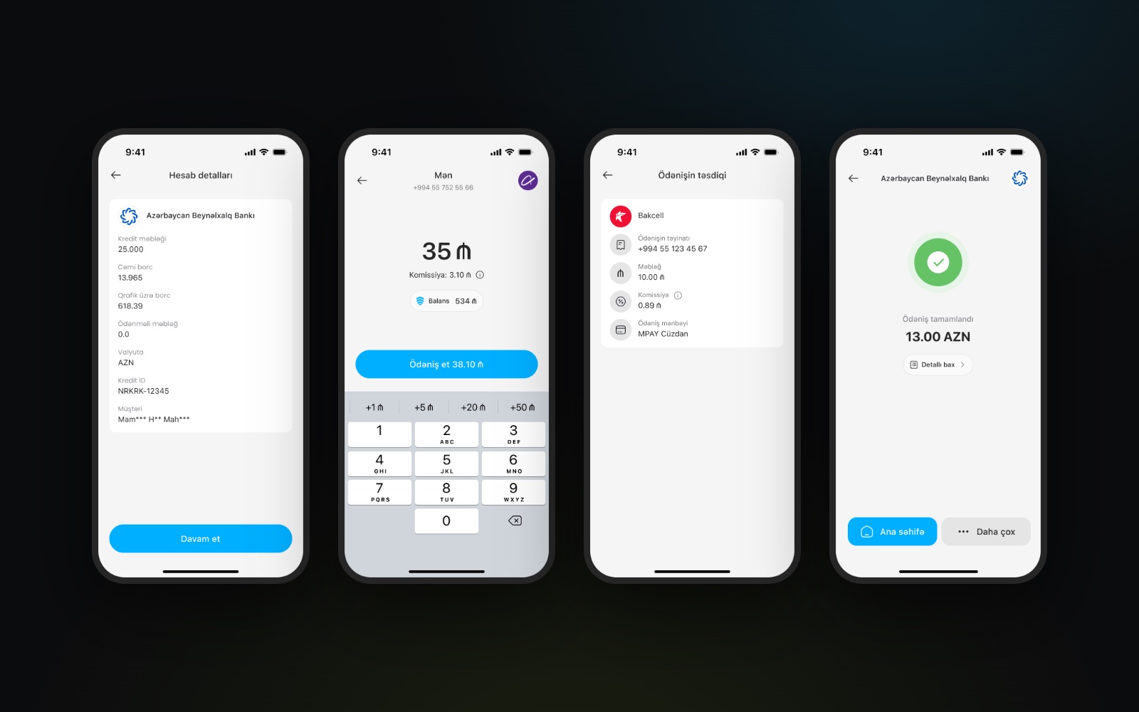
Pay a bill in a few steps
Pick the service, check the account details, enter the amount with quick presets, confirm the fee and source, and get a clear confirmation.
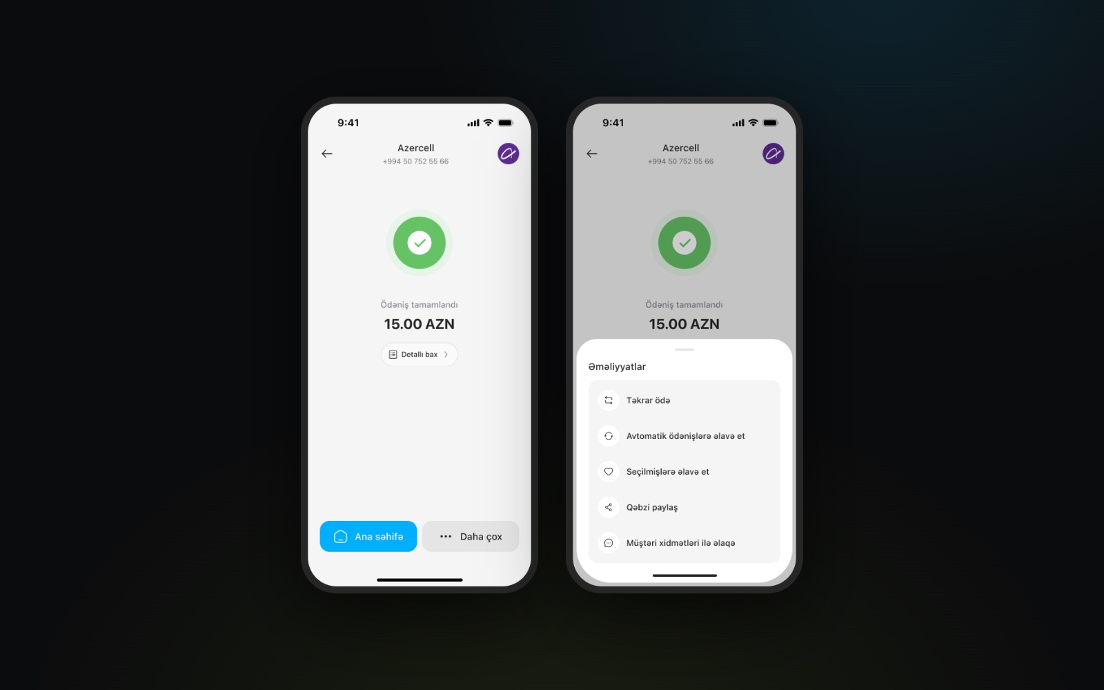
After the payment
A clear confirmation, then a sheet of next steps: repeat the payment, add it to automatic payments or favourites, share the receipt or contact support.
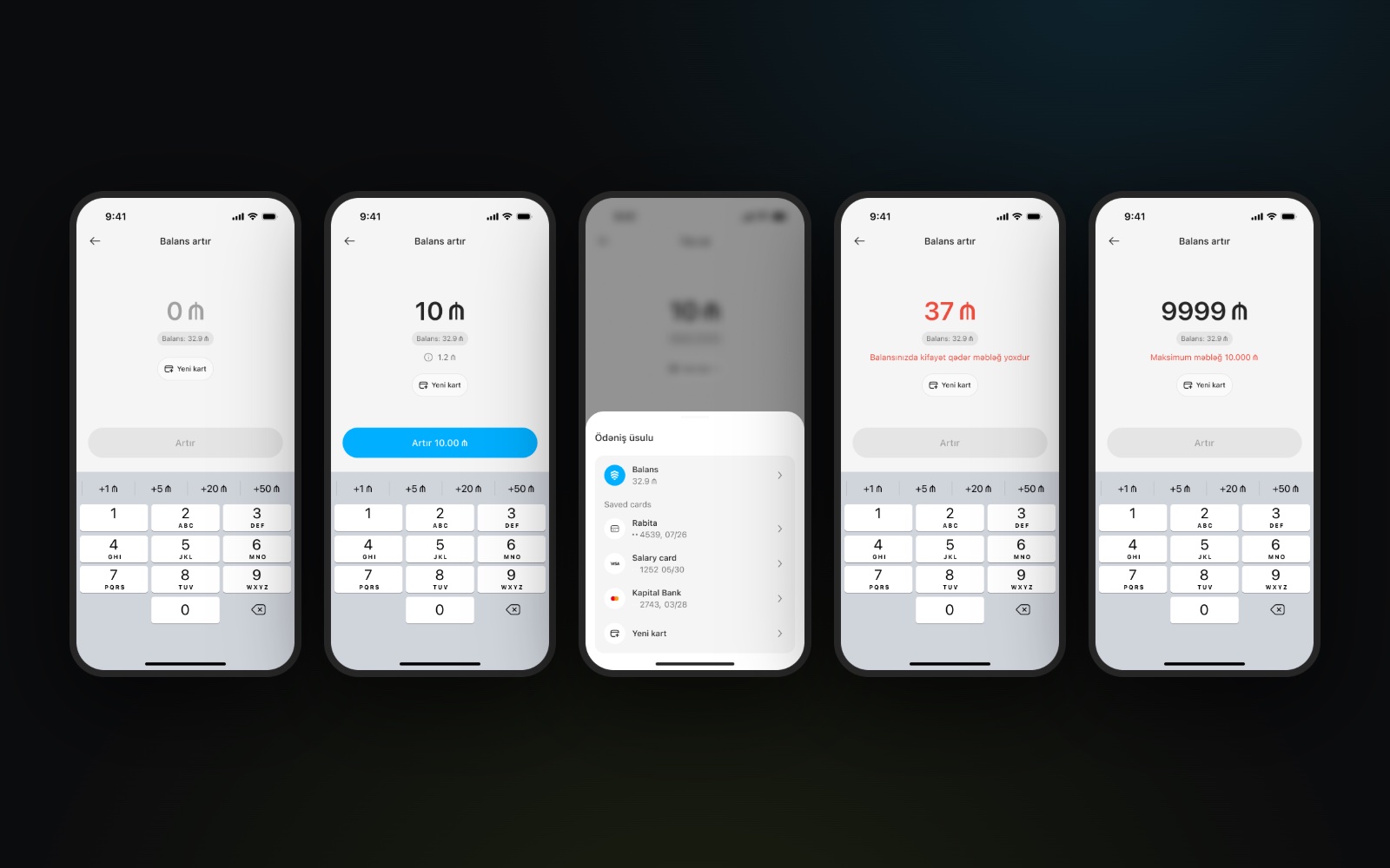
Top up with guardrails
Choose an amount with quick presets and pick a source — balance or a saved card. The fee shows before you pay, and limits like not enough balance or the 10,000 ₼ maximum are explained in place.
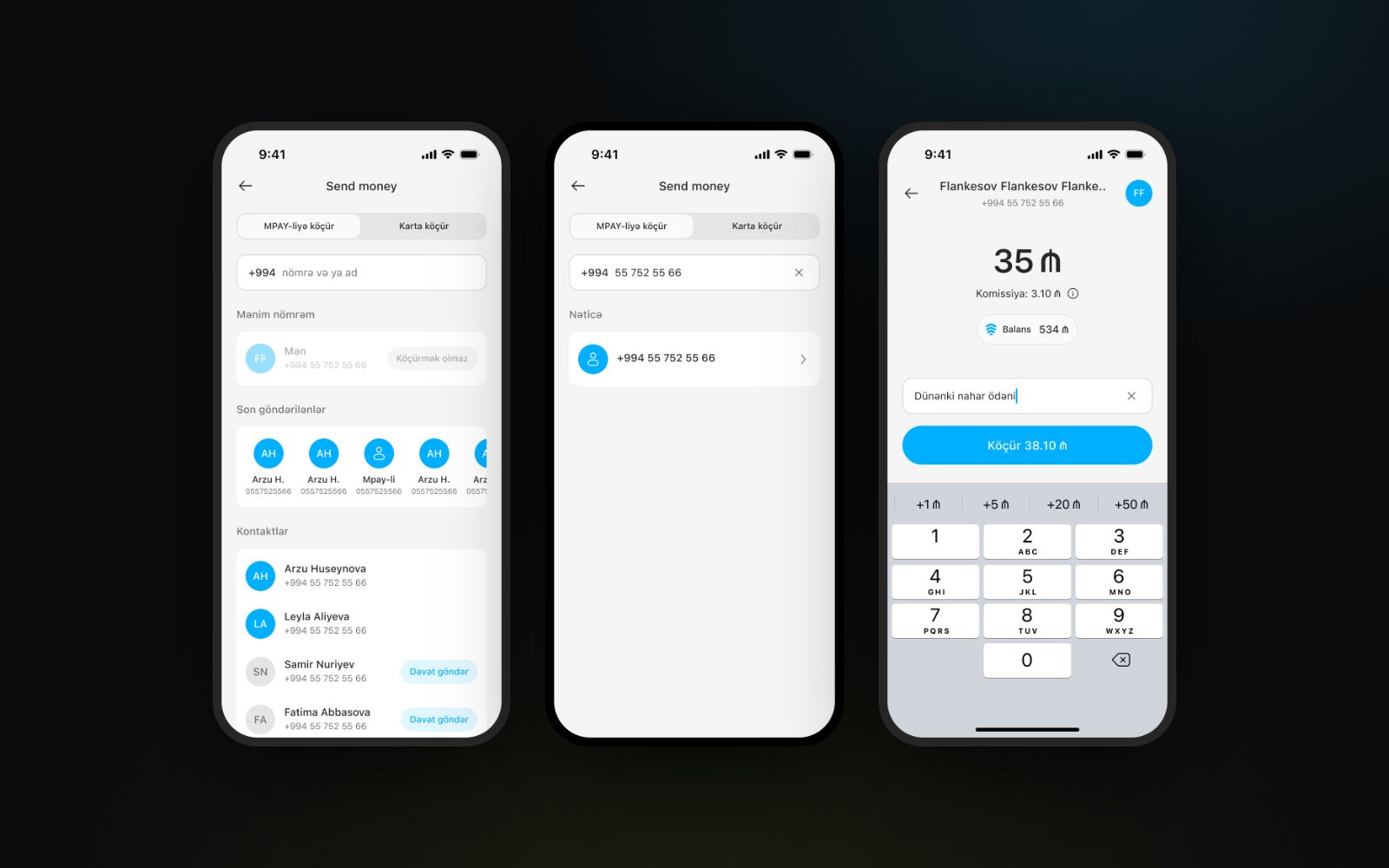
Send money by phone number
Transfer to another MPAY wallet or to a card: search by number or name, pick a recent recipient or a contact, add a note and see the fee before sending.
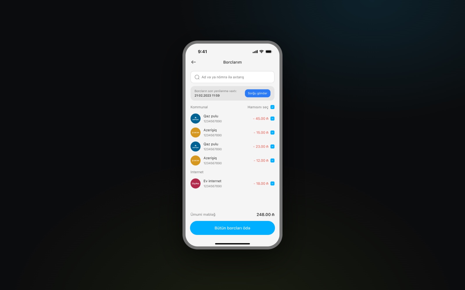
Pay all debts at once
Outstanding utility and internet debts in one list, grouped by provider, with the total at the bottom and one button to pay them all.
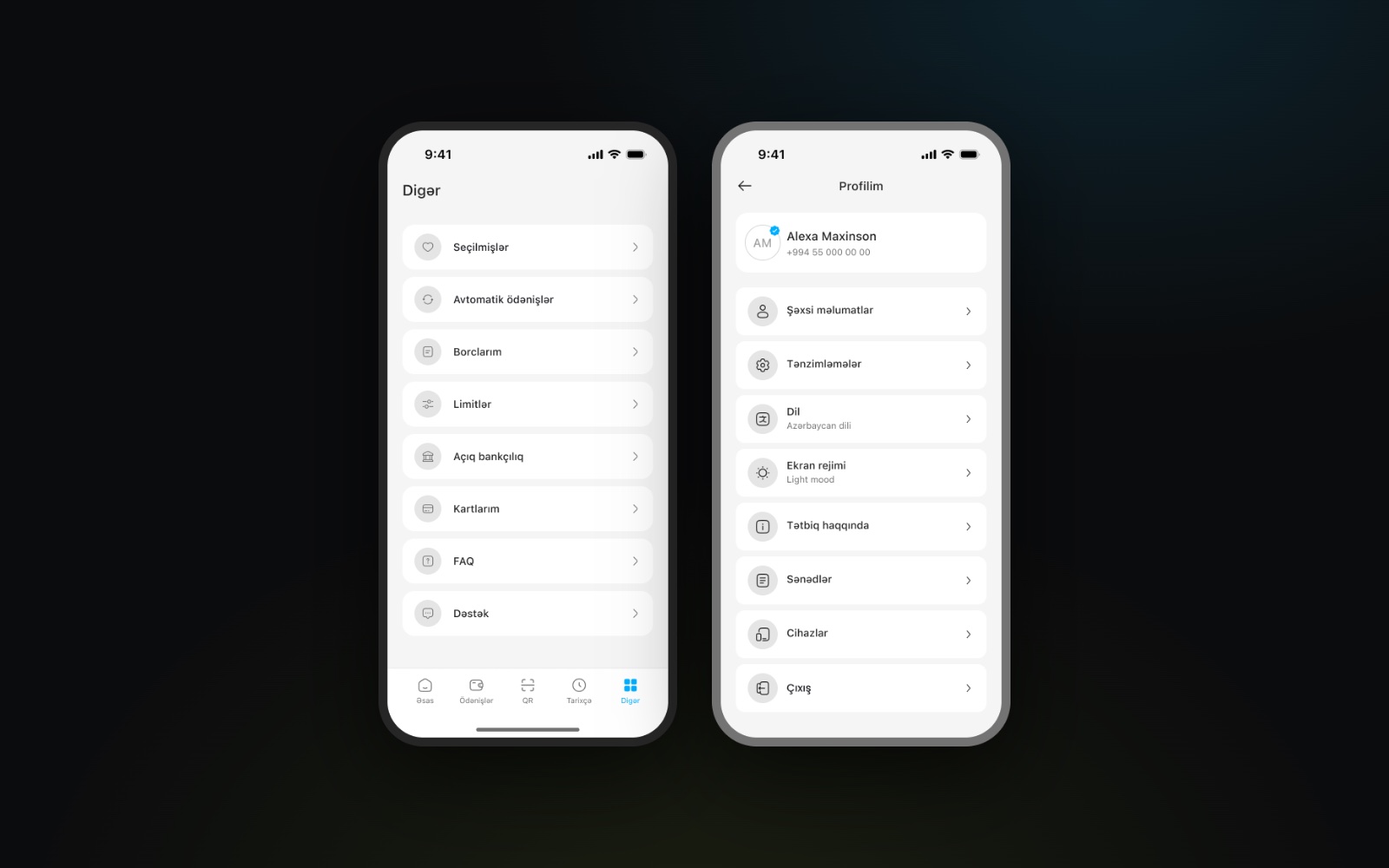
Profile and settings
Everything else in one place: favourites, automatic payments, debts, limits, open banking, cards, FAQ and support, plus a profile with personal details, language and theme.
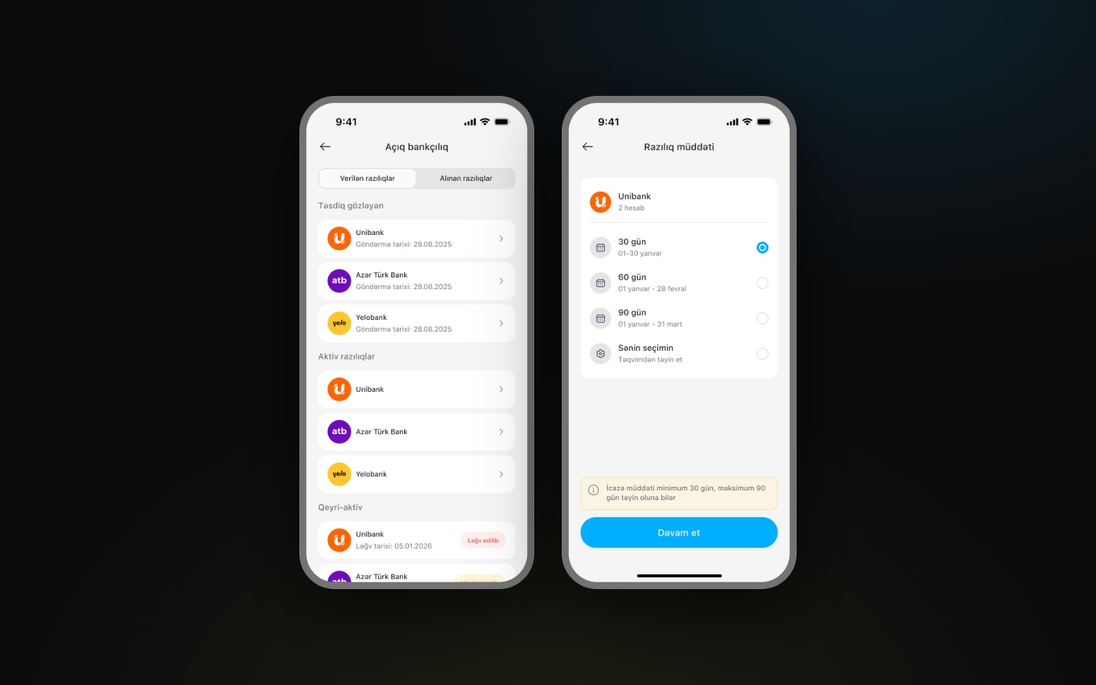
Open banking consents
See which banks have access, which consents are active or expired, and choose how long a new consent lasts.
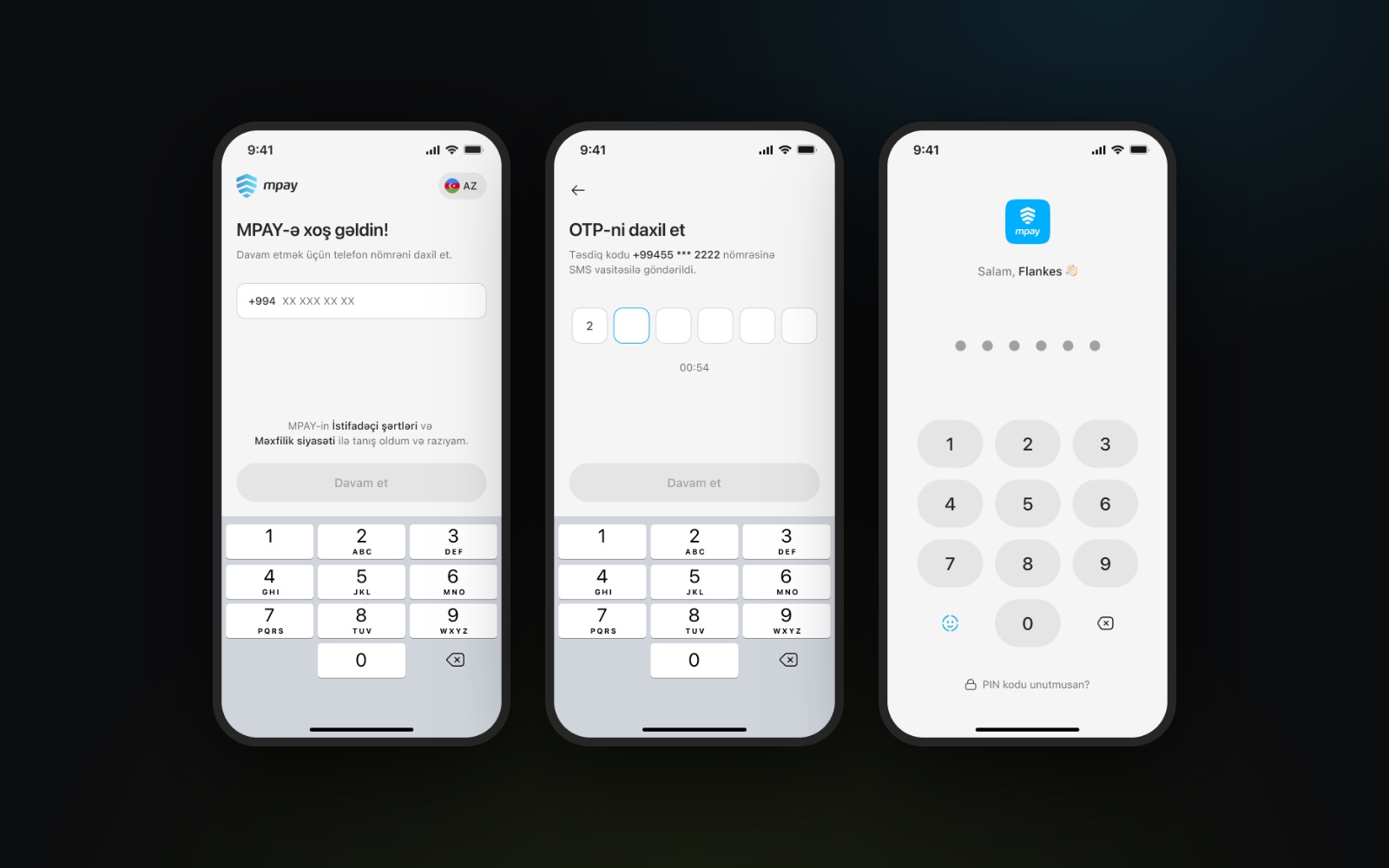
Sign in with a phone number
Phone number, a one-time SMS code and a PIN for returning users: three short screens with a numeric keypad built in.
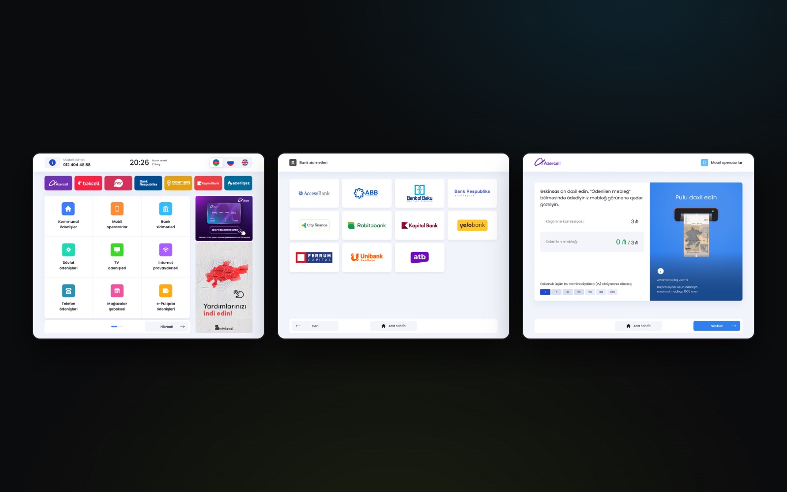
Payment terminal
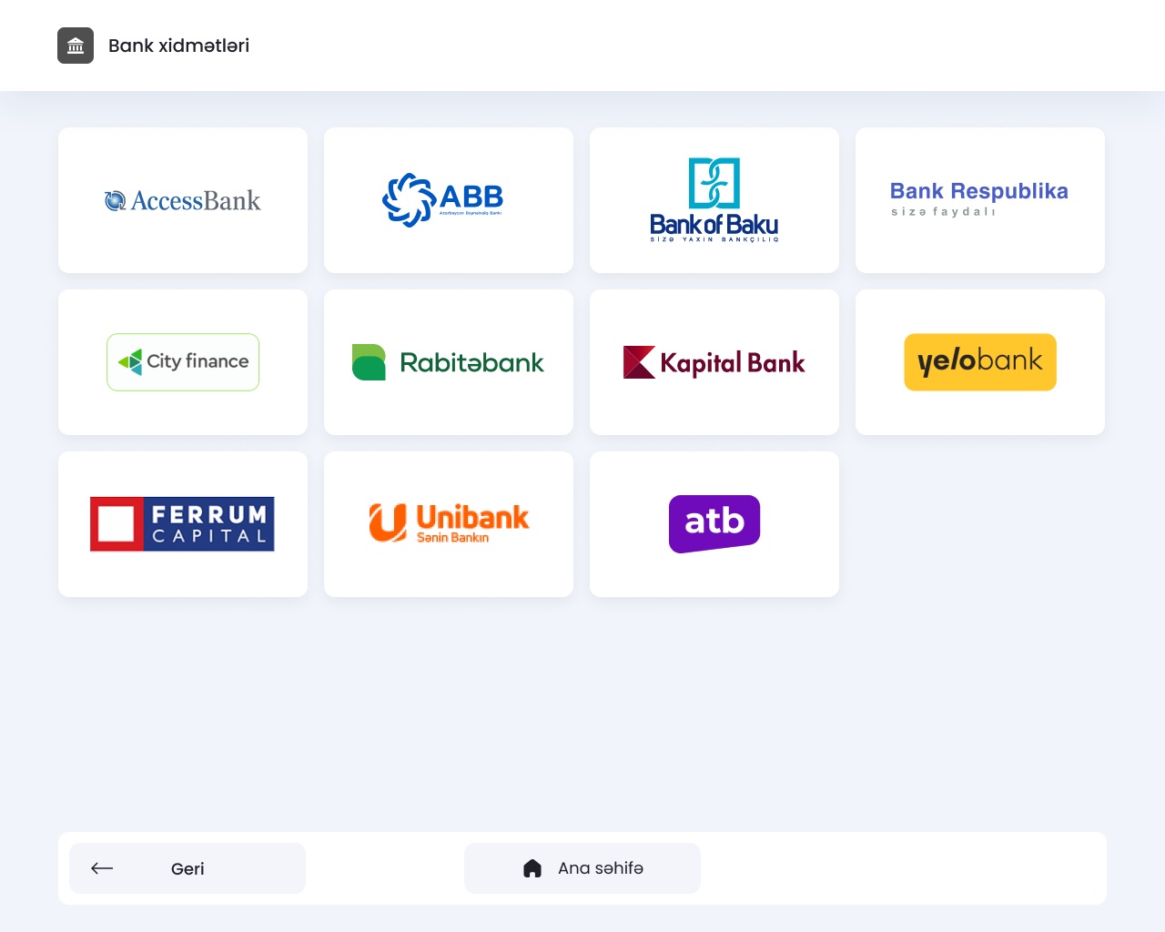
A touch interface for MPAY terminals: large service tiles, operator and bank logos, promo banners, and a cash flow that shows the fee and the amount as notes go in.
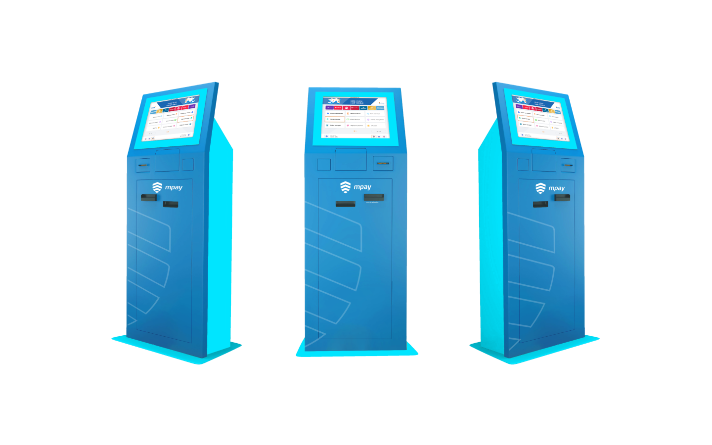
Terminal exterior design
The terminal itself, designed from scratch: the shape of the kiosk, its proportions and the MPAY branding on the body — the physical product people walk up to, not just the screen.
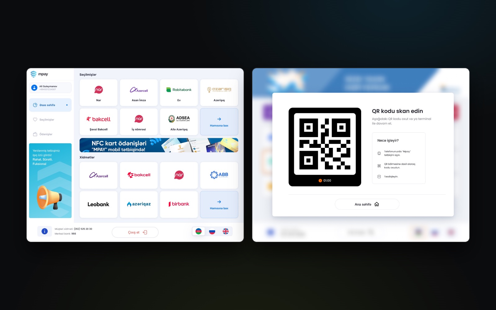
Personal cabinet on the terminal
Signed-in users see their favourites and services on the terminal screen, can log in with a QR code from the app, and switch language in one tap.
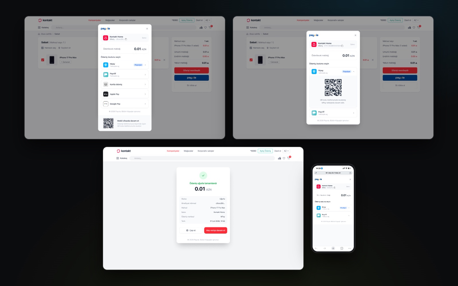
PayVia checkout
A checkout for partner websites like Kontakt Home: the customer picks MPAY, Payriff, a card, Apple Pay or Google Pay, pays by scanning a QR code with the app, and gets a receipt — on desktop and mobile.
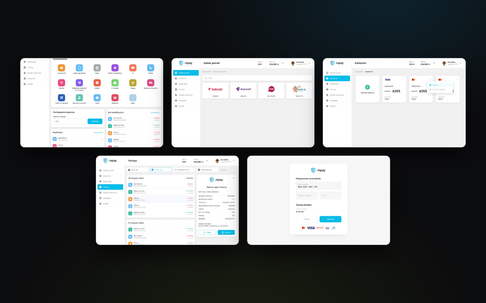
Web dashboard
The earlier web version: a dashboard with service categories and quick transfers, provider pages, saved cards, the card payment page and a full transaction history.
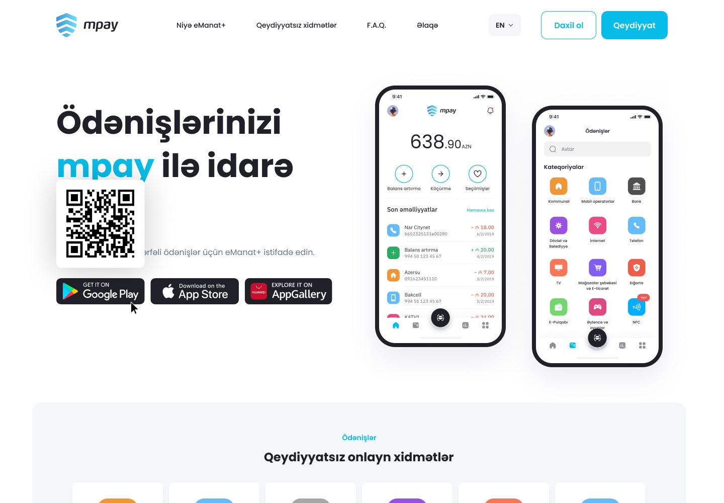
Landing page
The MPAY landing page: the app, its main features and QR codes to download it from the stores.
Before / after — drag to compare
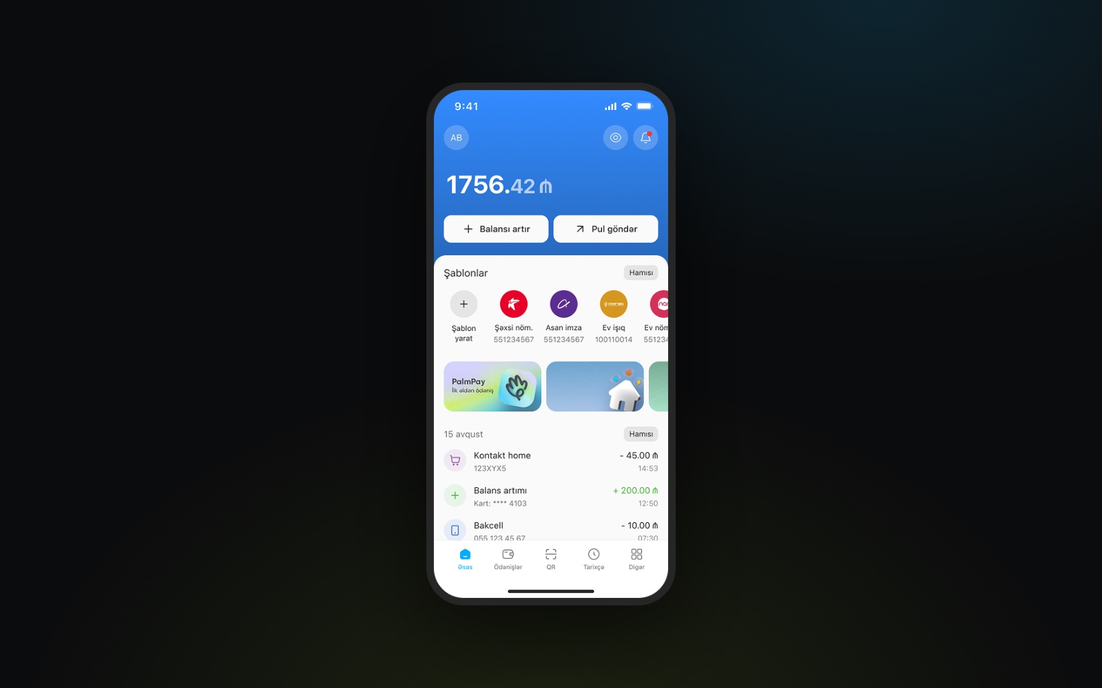
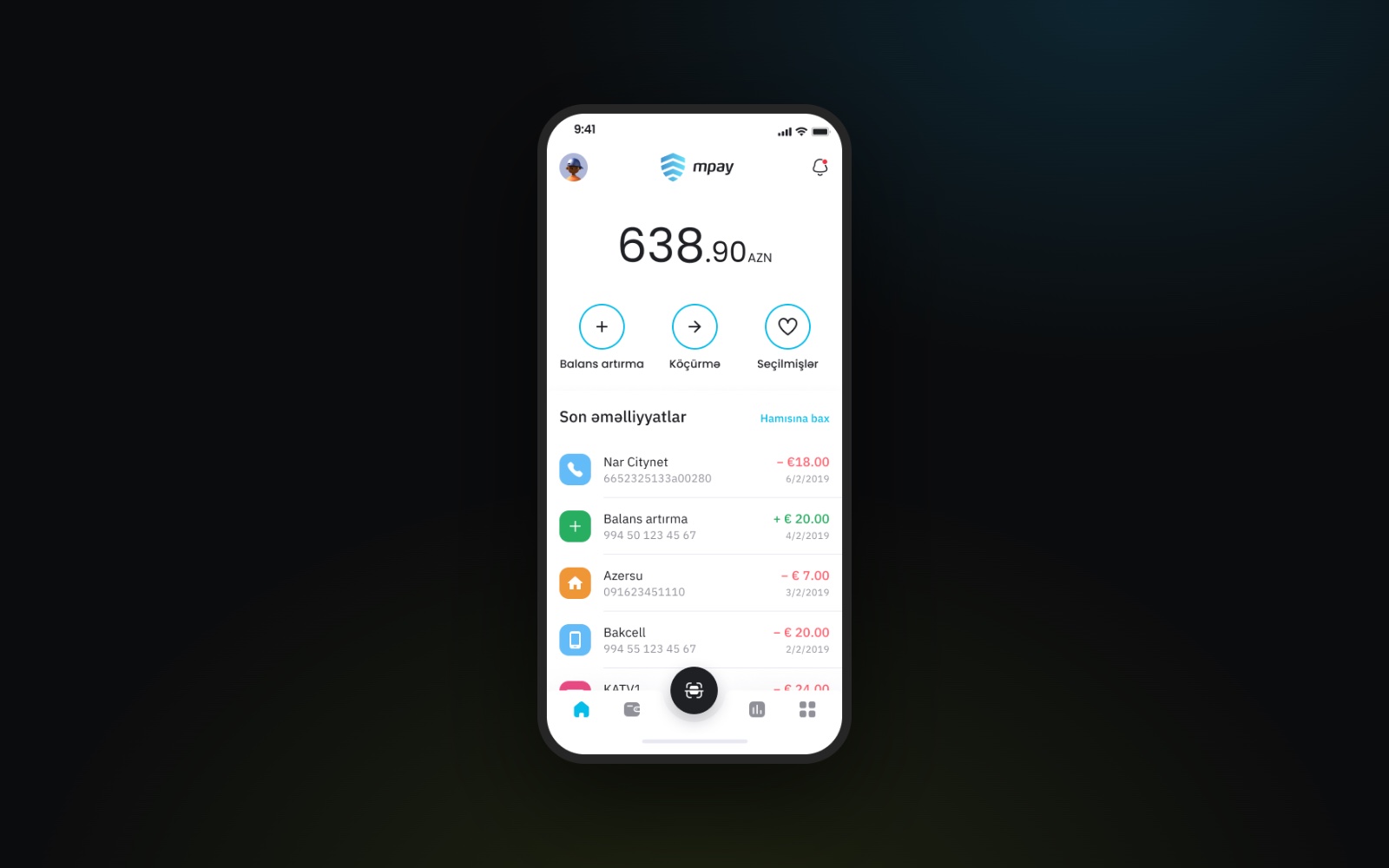
MPAY 1.0 and MPAY 3.0: the same home screen, rebuilt around templates, quick actions and activity grouped by day.
06
Timeline
2021
- Emanat+ Mobile App
2021 – 2024
- UI Kit
2021 – 2026
- UX Research & Product Discovery
- Logo Library (800+)
2022
- MPay 1.0 Mobile App
- Landing Page
- Dashboard
- Responsive Dashboard
2023
- MPay 2.0
- Backoffice
- Mobile POS
- Terminal
2024
- MPay 2.1
- Terminal V2
2024 – 2026
- Design System
2025
- MPay Business
2026
- AML Module
07
Delivery
Every product ships on the same foundation: a UI kit started in 2021 that grew into a full design system in 2024, with shared components, tokens and a library of 800+ provider logos. Alongside the product work I run UX research and product discovery, and I work with product and engineering on every release, from the first flow to QA.
08
Impact
- 500K+
- Downloads of the MPAY app on Google Play
- 18K+
- User ratings across Google Play and the App Store, 4.8★ on iOS
- 12+
- Products designed since 2021, from mobile apps to terminals
09
Learnings
- 01Familiarity — simplify payment flows without losing the cues people rely on.
- 02Consistency — carry one design language across the app and terminal, adapted to each.
- 03Clarity — make payment outcomes and next steps as clear as the payment itself.
- 04Design system — refine shared components through real product needs.
- 05Evolution — revisit earlier decisions as new services become part of MPay.