
PalmPay.
A new payment experience. In the palm of your hand.
Product design across PalmPay’s mobile app and POS terminal, connecting biometric enrolment with palm-based payments in one cohesive experience.
- 1 week
- To design the mobile app and the POS and hand everything to development
- 2
- Surfaces designed as one experience: the mobile app and the POS terminal
- 4
- Core flows: registration, payment, refunds and account management
Challenge
People were meeting biometric payment for the first time. Registration, identification and payment all had to feel simple and trustworthy at once.
What I did
Designed one experience across the mobile app and the POS, turned biometric enrolment into guided steps, and delivered the full design to development in one week.
Impact
Registration, payment, refund and account flows were designed and prototyped, with a reusable design structure established for the MVP and beyond.
01
Context
PalmPay brings palm-based payments into the MPay ecosystem. Customers register through the app and enrol their palms at a terminal, then pay without presenting a card, phone or cash. The design connects customer registration and account management with the merchant’s payment and refund experience.
02
The problem
Paying with your palm is a new behaviour, so people needed to understand it and trust it before they'd try it. Biometric enrolment is where people are most likely to give up halfway. And the mobile app and the POS had to feel like one product, even though they run on very different screens.
Constraints
- A brand-new behaviour for users
- Biometric data and trust
- Small POS screen and hardware limits
- Two surfaces: app and POS
- One-week timeline
03
Goals
Business goals
- Launch a single biometric payment experience across app and POS
- Get the MVP design ready for development within a week
- Build a design structure that can grow with the product
User goals
- Pay quickly and safely with just a palm
- Register once, without confusion or drop-off
- Always know what's happening: status, errors and success
04
Discovery
- Insight 01
A new behaviour needs guidance
Palm payment was new to everyone, so every step had to explain itself instead of assuming people knew what to do.
- Insight 02
Enrolment is the drop-off point
Biometric registration is where people abandon the flow. Breaking it into short guided steps kept them moving.
- Insight 03
Trust comes from feedback
Clear status, error and success messages at the critical moments made a sensitive process feel reliable.
05
The solution
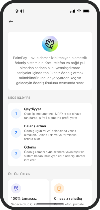
A clear introduction to palm payments
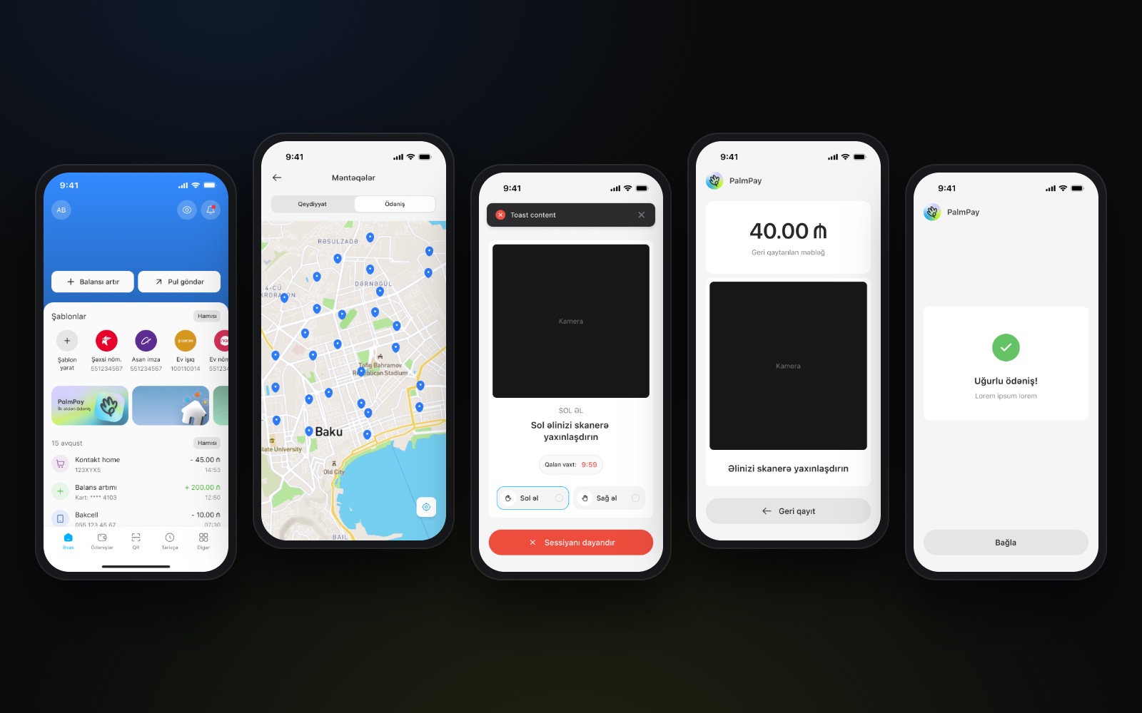
PalmPay’s introduction brings registration, balance top-ups and payment into one simple overview, helping people understand how the service works before getting started.
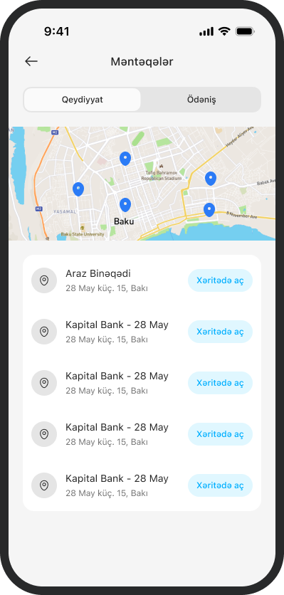
Find where to register and pay
A map and location list connect PalmPay to the places where people can use it. Separate views for registration and payment help customers find the right location for their next step.
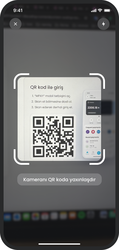
From the app to the terminal
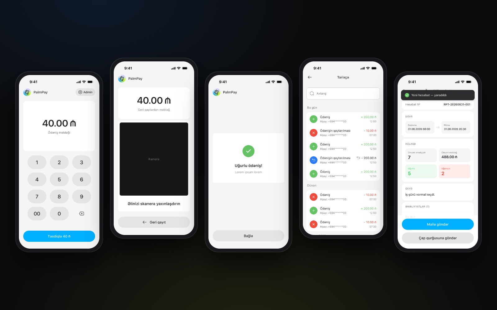
Scanning a QR code connects the mobile app with the terminal, creating a clear transition between the two parts of the experience.
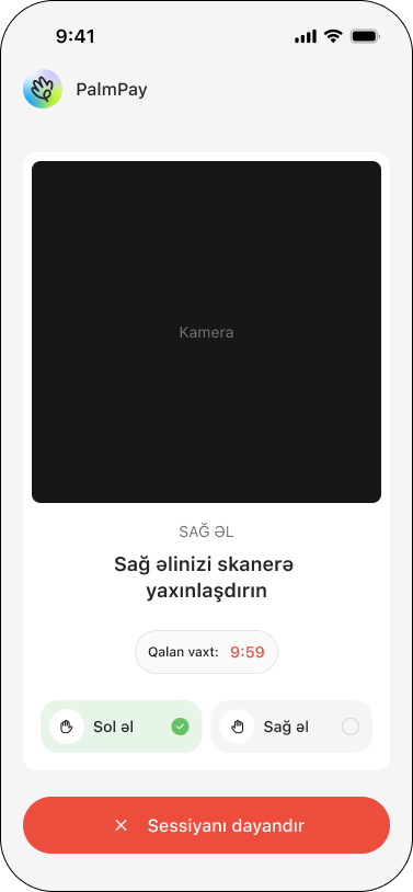
Clear guidance for a new experience
Palm registration follows a simple sequence, with instructions for each hand and visible progress throughout. Customers can see what is complete, what comes next and how to stop the session.
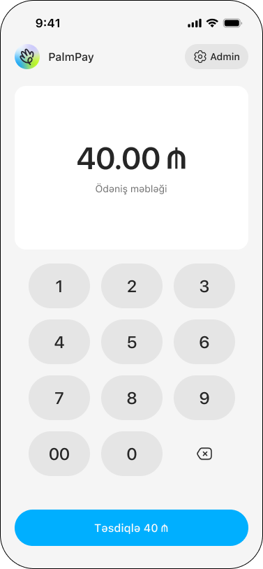
A focused start to every payment
A prominent amount, a simple keypad and a clear confirmation button give the cashier a straightforward way to prepare the payment before the customer scans their palm.
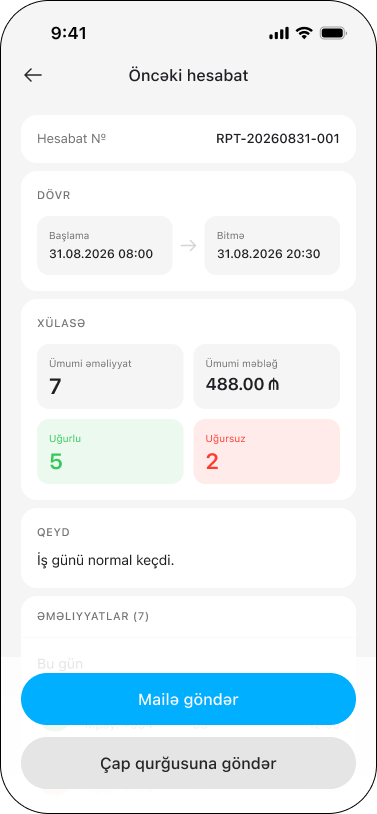
The trading day, at a glance
Transaction totals, payment amounts and successful or failed operations come together in one report. Merchants can review the selected period, then email or print the summary.
A clear record of every transaction
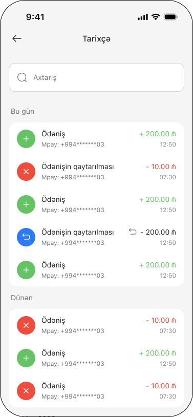
Payments and refunds sit in one searchable history, grouped by day. Distinct visual cues make transaction types and statuses easy to recognise while keeping amounts and times within view.
The details behind each payment
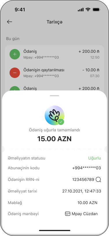
A dedicated detail sheet brings the transaction status, reference number, date and payment source together, giving merchants the information they need to check a payment or answer a customer’s question.
06
Delivery
Because the product had to be presented quickly, I focused on the core user scenarios and completed the design for both the mobile app and the POS in one week. I built one experience across both surfaces, so users meet the same logic and behaviour patterns throughout, designed the POS flows around the terminal's screen size and technical limits, and prototyped registration, identification, payment and refunds. Everything was shared with the development team, along with a repeatable, extendable design structure for the product's next stages.