
CityCard.
A brand-new way to pay for city transport, designed from scratch across the passenger app and the on-board validator.
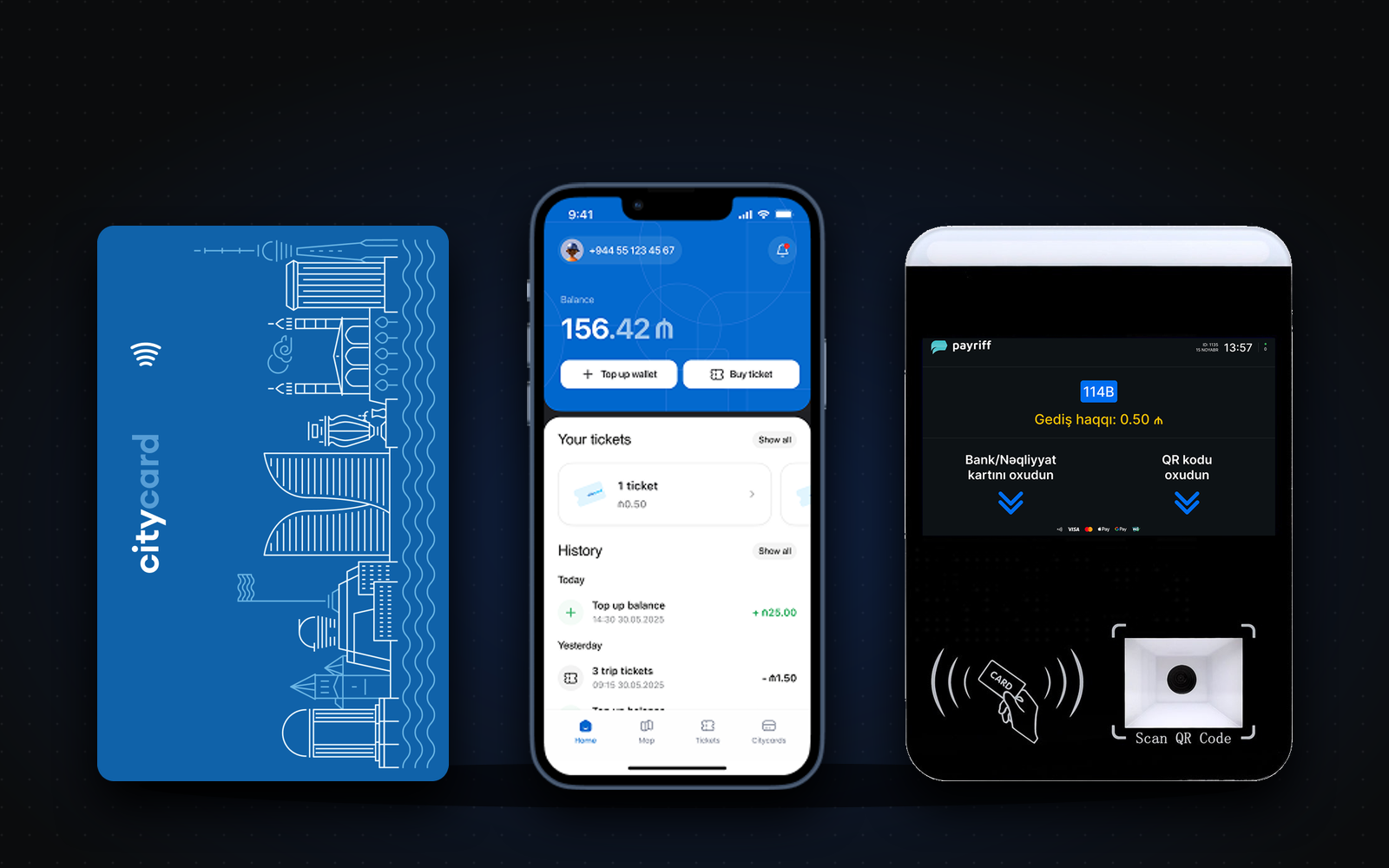
CityCard by Payriff: a digital ticketing and payment platform for city transport. Buy a ticket in the app, pay your way, scan a QR code and ride.
- 100K+
- Downloads on Google Play since the August 2025 launch
- 1,000+
- User ratings across the App Store and Google Play
- 2
- Surfaces designed as one product: the passenger app and the on-board validator
Challenge
Create an entirely new digital experience for city transport, across a mobile app and an on-board validator, with few local products to learn from.
What I did
Designed the core flows from scratch, prototyped buying, riding and validating a ticket, and worked with developers to keep every solution buildable.
Impact
The app and validator interfaces were designed as one consistent product, with the design foundation in place for the MVP.
01
Context
CityCard by Payriff is a digital ticketing and payment platform for city transport, available on iOS and Android. Passengers buy tickets in the app, pay with a CityCard, a bank card, Apple Pay or Google Pay, and board by scanning a QR code at the validator. Balance, active tickets and travel history live on one screen, and unused tickets can be refunded. The project covered both the passenger app and the interface of the validator installed on buses and other vehicles.
02
The problem
City transport needed a digital experience that didn't exist yet. The flows for both the mobile app and the validator had to be designed from scratch, the interaction between passenger and validator had to be fast and obvious, and there were few similar products in the local market to use as a reference.
Constraints
- Brand-new product
- Two surfaces: app and validator
- Few local references
- Fast passenger–validator interaction
- Tight timeline
03
Goals
Business goals
- Launch a digital ticketing and payment product for city transport
- Ship the app and the validator as one consistent product
- Get the MVP ready within a tight timeline
User goals
- Buy a ticket and board in seconds
- Pay the way they prefer
- See balance, tickets and travel history in one place
04
Discovery
- Insight 01
No local playbook
There were few comparable products in the local market, so the flows had to be defined from first principles rather than borrowed.
- Insight 02
Two devices, one moment
The app and the validator meet at the door of the bus. That handoff has to be instant and unmistakable for the whole product to work.
- Insight 03
Focus beats breadth
With limited time, the MVP had to prioritise the flows passengers use every day: buying, riding and checking a ticket.
05
The solution
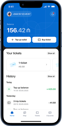
Everything on one screen
Wallet balance, active tickets and travel history on the home screen, with top-up and buying a ticket one tap away.
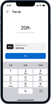
Top up in seconds
Add balance with Apple Pay, Google Pay or a bank card in a couple of taps. Balance can also be topped up at E-manat and MPay terminals.
Scan and ride
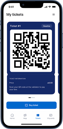
Each ticket is a unique QR code, valid for one ride. Scan it at the validator and go; unused tickets can be refunded in the app.
Before / after — drag to compare
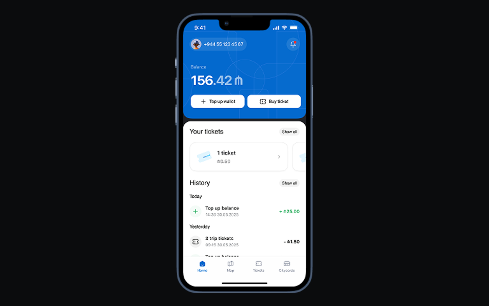
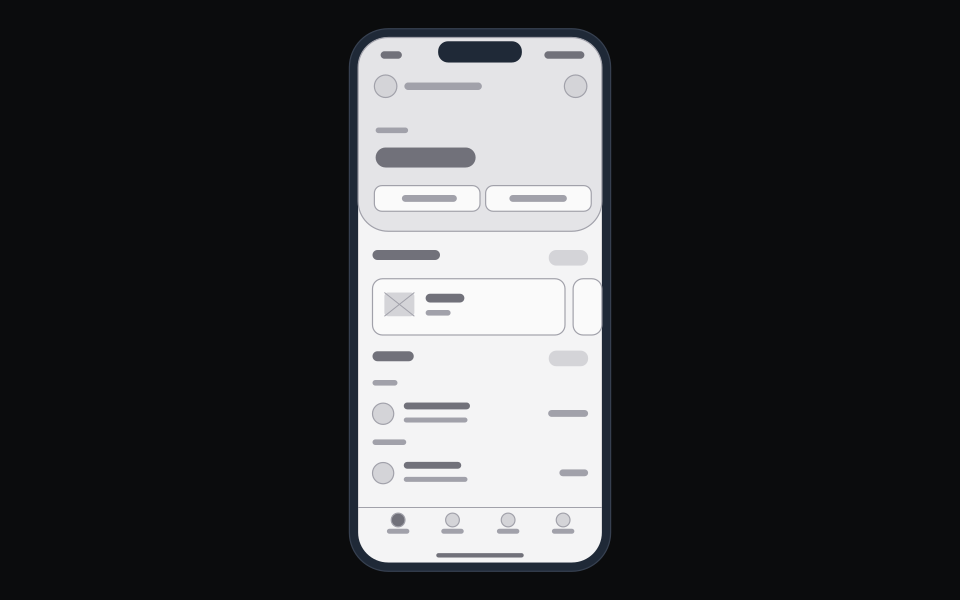
From wireframe to final screen: the home screen keeps balance, top-up, tickets and travel history in the same places, from the first sketch to the shipped app.
06
Delivery
I mapped the core flows for the app and the validator from scratch, and prototyped buying, riding and validating a ticket to define how the product behaves. I kept both surfaces consistent, worked through the main scenarios with the development team so every solution could be built, designed the card and ticket structures needed for launch, and kept the MVP focused on the highest-priority flows. The result: the user experience and interface of the mobile app and the validator, the digital flows for buying and using tickets, and a design foundation for building the MVP.
Passenger app
Buy ticket
Pay
QR ready
Validator
Scan
Paid ✓
Ride